
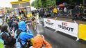
If you’ve been watching the Tour de France over the past week and a half, you’ve likely seen either the little gizmos pointing off the back of rider’s seats, or the constant stream of data on your TV about where precisely riders are at any given point in time. Both of these things are part of a system that Le Tour has partnered with via Dimension Data to transmit exact rider position in real-time from every rider in the peloton.
We’ve seen this type of real-time data streaming used in the past, even stretching back as far as 7 years ago. At that time they used small cell phones stuck in saddle-bags under a handful of rider’s seats, though they did also stream sensor data like power and heart rate. We’ve also seen other implementations as well – such as at the Tour Down Under this year with one team. And finally, we’ve seen single-day event implementations like that of with Quarq Race Intelligence and their Quarq Qollector used more in endurance racing.
So while the concept of live streaming data to you as a viewer isn’t new, how Dimension Data is doing it is definitely different than past attempts. But this is actually their second year doing so – and I wanted to dive into some of the tech and talk about not only how it works, but what they’ve changed from last year.
What’s on the bike:
It’s best to start at the source of the data, and in this case that’s a small tracking transmitter that’s attached to the back of every rider’s bike in the Tour. This transmitter is roughly the size and shape of a banana peel, though with more rigidity.
![]()
The transmitter can be removed from the bike’s saddle mounting system via a simple clip. It’s notable that this is not the official timing chip of the Tour de France. That’s actually the small blue pod you see near the rear of most bikes.


The Dimension Data folks noted that most seat rail systems are pretty similar, but that they’ve had to get creative on some bikes (especially some TT bikes), where under seat Di2 battery systems were in use.

Dimension Data issues one transmitter per athlete which are then attached to the bike the rider is using that day. But for more popular riders, they’ll also issue secondary devices for spare bikes. So if someone like Chris Froome were to crash and a team car comes along with his spare, then it’s likely to have a transmitter on it already. If that occurs the Dimension Data team would then manually switch over which transmitter was assigned to that rider.

The teams are responsible for charging the transmitters, which have about a 3-day battery life. They’re provided a small charging station where multiple units can be stashed in at once to charge.

Above you can see one in the back of Team Movistar’s mechanics truck after a stage. Most teams tend to charge the units every other day, just to keep things simple.
So how does the data get off the bikes? The tracker devices will connect directly via line of sight to one of the nearby race helicopters or aircraft that are used for transmitting the TV images you see during the race, using RF. It all piggybacks off that same system as the TV signals.

Further, the transmitters on the bikes actually create a WWAN (Wireless Wide Area Network ) mesh network between themselves. This means that they talk to each other (so one bike talks to another bike) so that if any given bike has a view of that aircraft, it can do the transmitting on behalf of others. Further, the various TV motorcycles can also act as a forwarder/transmitter. Thus between all that there’s pretty darn good coverage.
(Side note: They actually have a number of white papers, albeit some from last year, up on their site. Most of the concepts are the same this year)
Here’s the backend look at sensor coverage during the course of the stage as seen from the command center. Signal coverage sits at 99-100% throughout almost all of it, except for a brief few seconds it drops to only 20% coverage.
That point? A tunnel. That’s about the same point your TV screen shows you a pretty picture of a nearby chateau.

The data is collected at every-second intervals, though they are testing half-second intervals to see how that might change things (for example, in sprints).
Remember that helicopter? Well, there’s actually a few of them plus the planes, and what’s fascinating is to see the track they make in the sky following along the race. Here’s what it looks like:
The #TDF2017 Stage 9 spirograph.
https://t.co/s6KY1z7KgS pic.twitter.com/TvpKrU8MCu
— Flightradar24 (@flightradar24) July 9, 2017
Impressive, huh? So with the data successfully transmitted off the rider’s back, where does it go from there?
Data in the cloud:
 Next, the ‘cloud’. Of course, for all its popularity, the term ‘cloud’ is nothing but a marketing thing adopted by tech companies to make less sexy terms like ‘fault tolerant and elastic web service endpoints’ sound more interesting. No worries, it seems to have worked. And in Dimension Data’s case – this is all about promoting their cloud platform. Or at the very least their IT services and capabilities. Thus that cycling data gets relayed in a hosted platform atop Dimension Data’s cloud platform. That platform is hosted in Amsterdam, but is kept in sync with further servers in London – providing redundancy there. It’s the same platform they ultimately pitch to enterprises as well (minus the helicopters). While the data is now collected into a large SQL data service, that’s actually just the beginning of where it goes. Before we talk about external people that use the data (like broadcasters), there’s actually a multitude of teams within Dimension Data that leverage it. If you’ve been following along on their Twitter feed (or many other cycling Twitter accounts that re-tweet it), you’ve likely seen tweets like this:
The peloton mostly led by @EquipeFDJ & @Lotto_Soudal sets its pace according to the break’s: 40.14 km/h at the front of the race.#TDFdata pic.twitter.com/iD8hQFFH1V — letourdata (@letourdata) July 6, 2017
These tweets are created by a social-focused team in London looking at the data in real-time. While last year they had this team in the truck with them at the Tour, they found that for the most part it was logistically simpler to have these people in London (rather than the massive hassle/disruption/exhaustion of moving hundreds of kilometers each day).
They also had one day where due to high winds and road closures the team and truck got split up, potentially causing service issues (though they had redundancy for that too). Nevertheless, leaving them back in London just made life easier for everyone.
The data that’s utilized at the Tour is actually relatively simplistic: Just position and speed. While the transmitters do have an altimeter internal to them, that data isn’t used here. Instead they cross-reference position against known altitude from various mapping services. This is done so you don’t have 190 different altimeter readings mid-race. The below is pulled from their site, which you can also watch in real-time.

Further, the transmitters at the Tour aren’t collecting/transmitting any sensor data from the rider. So no power, heart rate, or cadence data. This is because many of the teams have expressed concerns about this data from a competitiveness standpoint These specific transmitters don’t have ANT+/Bluetooth Smart within them, though the company does have other transmitters that do have that capability and which they’ve used at other races to collect that data.
One of the more unique things that Dimension Data is doing is determining where the gaps are in the race. In other words – what constitutes the breakaway? Or the peloton? Or when someone has ‘dropped off the back’? To do that it’s easiest to see the raw data coming in. Here we can see all the riders at this point in the stage:

Note above the first three riders have a gap of 0’00” to the leader. This is because it looks at the position of these riders and decides they’re all in the same place. It’s doing this based on a calculation of data points at 10-meter intervals. If a rider is within a preset distance moving at roughly same speed, they’re considered part of that group.
If you look above/below you can see that while the gap to the leader varies as you scroll down the list (from +1’32” down to +1’45”), that’s all considered the peloton. But that last rider at +1’55”? He’s considered “off the back”.

These chunks are put into logical ‘groupings’ that you see. There could be break-aways, chase groups, pelotons, off the back, etc… Here’s a list of the three groups for the stage I was looking at:

And then on the backend they can easily expand out the riders in that group:

This is also useful if they think that a bike may have been swapped. For example that person off the back, they’ll usually double-check that’s not a bike now sitting on a team car driving behind. If so, they’d remove that sensor from the platform for the rest of the day to avoid confusion.
Of course, the broadcasters view of this is much prettier. Here’s how that looks:

But everything I’ve talked to at this point is relatively simple in terms of data. Sure the grouping requires a little bit of logic, but otherwise there’s not much algorithmically going on here. For that we need to move into the next section.
Data Analytics:
Now that the data is relatively normalized, Dimension Data starts to overlay additional data sources atop it. For example, they’ll take weather station data from weather data providers along that route. Then they’ll layer in the trusted elevation data to get gradient. Here’s how that looks:

Except notice something in that right column? It’s actually looking at the wind direction relative to the rider’s direction. Meaning that they know, based on the wind direction and rider’s direction, whether it’s a headwind or a crosswind at that very moment in the road. Sure it’s easy to say “winds from the east”, but rarely are roads perfectly straight – especially near mountains or valleys. If the route changes direction for 5KM into a stiff wind, that could impact the breakaway’s ability to stay ahead.
Then they start looking at the moving averages (speeds) of these groups, as well as the upcoming terrain. For example, you can see below that the upper graph is the moving average and altitude of the breakaway. Whereas the lower portion is the peloton. In this case, both groups are staying relatively constant, save the differences in terrain.

From there they start plotting graphs like below; is the peloton gaining on the breakaway? In the case of below, still somewhat early into a stage, the breakaway has started to stabilize, which means they’re likely starting to run out of steam.

And then based on that and looking at the data from past stages and efforts as well as terrain, they start to create breakaway predictors, such as this:

And their Twitter feed is full of these types of charts. Be it who pushes the pace (because they know that based on looking at who positionally is leading the peloton or a breakaway), or stage sprint finishes like this:

Their goal here being to pull you into the race. Which is why they’re actually not just some random company doing this for fun, but rather a formal partnership with ASO, the organizers of the Tour de France. ASO, along with other race organizers, recognize that the more data you can provide and create nifty charts like above – the more interest you can generate for an event. That could be real-time interesting, or after the fact interest via social media.
This is true whether it’s the Tour de France, the Ironman World Championship, or even an NFL game. Data can be exciting when it’s presented in interesting and captivating charts. They are effectively the memes of the Tour de France. But they aren’t the only consumers of this data.
Getting it to broadcasters:

At this point, I’ve only talked about how the data flows as well as some of the pretty images spit out on a Twitter feed. But there’s still an entire team and a gigantic truck I haven’t mentioned yet. That’s the team and truck that travels every day to the finish-line of each stage. This double-decker semi-truck-bus-thing acts as a mobile command center for this entire project. Inside it sits the team in charge of the data and ensuring it gets to their broadcast partners.

While the Twitter account is handled out of London, the coordination with ASO and over 100 commentators and broadcasters is dealt with here. On the small screen to the bottom left they’ve also got technical teams in California and India live every day via teleconference (plus London), watching over the data as well.

See, Dimension Data is actually providing the underlying data for everything you see on TV too. So all the splits and times are coming from the same data source as their online site. To do that Dimension Data has different ways they get data to the 40 or so broadcast trucks around the sprawling technical zone at the Tour de France. There are basically three options for broadcasters:
1) Dimension Data gives a laptop/tablet/device to that broadcaster each day, which connects via private WWAN (Wireless Wide Area Network) across the technical zone. Some 60 devices are handed out…and retrieved by Dimension Data, each morning and evening. In this case the device is fully on a Dimension Data network/internet.
2) Some broadcasters will use the Dimension Data provided device, but use their own internet connection.
3) Finally, some will use their own device and their own internet connection, and connect to the cloud platform directly.
So why might a broadcaster use a Dimension Data device versus just using their own? Well, two reasons. First, logistically it’s simpler to support. It’s just a known good. But second – and more importantly – Dimension Data actually has a copy of the data locally in a mini-server cabinet on the truck. Thus they are able to largely ensure connectivity through secondary means to the data should a broadcaster have challenges with their devices internet.

Dimension Data meanwhile each day not only has to hand-out/pickup all those devices, but also setup wired connectivity to Orange (telecom provider) that follows the Tour around too. Orange, in turn, has redundant connectivity to the interwebs at large.
How each broadcaster uses the data varies. For example, NBC will use the raw data feeds and do all their own graphics and overlays. Totally custom. Whereas the other 95% of Tour de France broadcasters will use the data overlays and graphics done by France TV, which is the underlying provider of video for the Tour. Meanwhile, Eurosport splits the difference and does half and half. They do some of their own stuff while also taking some of the defaults.
In case you were wondering, this is what the default video feeds look like from the Tour. Dimension Data can watch all 9 live cameras at any point in time, which helps them to validate things like whether or not there’s been a crash and a bike (and thus transmitter) has been swapped out:

What’s probably most impressive though in this whole thing may not be the data analytics or predictions. But rather to remember that everything we’re talking about is a gigantic moving machine that is constantly in motion from city to city. It’s 190 bikes moving on a road with multiple helicopters and airplanes circling about relaying to a data platform a thousand miles away that’s syncing back with a truck at a random town in the mountains that moves 200-300KM each day, all accompanied by hundreds of people in the TV realm reading the data in near real-time on tablets chaotically sprinkled around the finish area of a town.
The Future:

So where’s this all going? Well, it probably depends on who you ask.
If you ask Dimension Data they’d likely say the goal is to get you to look at their capabilities as an IT company. If you ask ASO (organizers of The Tour), they’d say it’s about getting fans more engaged with the sport. If you ask fans, they’d say it’s providing more insight into what’s happening on the Tour and their favorite riders in real-time.
But what about the teams? Well, that’s where it’s a bit interesting.
Right now the platform put in place is technically a step back from what we used to see with data like power and heart rate being included. It sounds like certainly some teams are open to this, but not all (for a variety of reasons, but mainly competition). Dimension Data (like other companies in this space) have shown that they can technically deliver this data to viewers, if they can get teams on board. And certainly viewers have shown they enjoy the insight this data provides.
But what’s missing from this whole picture is how the teams themselves could really leverage this data, either just their own data portions or the entire set en mass.
Today they can view the data like any other person on the web, but the potential here for really doing deeper analytics on their own riders is certainly more interesting. Similarly, if this data also included sensors for just private team access, that could be immensely useful in team cars to view their own riders. Of course with Dimension Data also sponsoring a team in The Tour, it’s understandable why teams would be hesitant to allow such access.
Still, I think the direction of where things are going is definitely good for the sport. Insight like this not only engages fans, but also provides a second layer of data against concerns around mechanical cheating (especially on climbs). Plus, it’s just basically porn for cycling geeks.
With that – thanks for reading!
—
If you missed my other four Tour de France 2017 posts, here ya go:
Tour de France 2017 Behind the Scenes: Stage 1
Tour de France 2017 Behind the Scenes: Stage 2
Tour de France 2017–The Trainers, Power Meters and Gadgets of the Pro Peloton
Tour de France 2017 Behind the Scenes: Stage 6
And if you want to see all my past TdF posts (mostly behind the scenes), they can be found here. Plus, my spectator guide here. I’m not quite sure which stage I’ll pop into next, so stay tuned to Twitter!
FOUND THIS POST USEFUL? SUPPORT THE SITE!
Hopefully, you found this post useful. The website is really a labor of love, so please consider becoming a DC RAINMAKER Supporter. This gets you an ad-free experience, and access to our (mostly) bi-monthly behind-the-scenes video series of “Shed Talkin’”.
Support DCRainMaker - Shop on Amazon
Otherwise, perhaps consider using the below link if shopping on Amazon. As an Amazon Associate, I earn from qualifying purchases. It doesn’t cost you anything extra, but your purchases help support this website a lot. It could simply be buying toilet paper, or this pizza oven we use and love.


Do you have info if climbing speeds (vertical meters per hour) also aren’t allowed to be used? Guess that with gradient and speed it wouldn’t be so hard to make the calculation.
They talked about doing much more around some of that as the Tour got into the mounts (like today), and especially over the final week.
Very interesting, thank you Ray! You are still an IT geek:)
Greetings from a former colleague.
We want to see good,honest cycling, and exciting breakaways or sprints. Not this 0s and 1s shit. Nobody cares about stupid graphs. The Riding is where it’s at.
You can still see all that goodness. You just get some numbers overlaid. As for nobody caring, well, the interwebs would disagree with you.
Very cool!
Thanks for the in-depth look into the nuts and bolts of the tour’s communication network. Very cool!
Fascinating. I’m glued to the telly every night here in Melbourne while cheering on George Bennett, my old club mate from Nelson, NZ. Love seeing a Kiwi climbing with the top riders in the world (and proving he belongs there!)
The next step will be training the commentators (Matt Keenan and Robbie McEwen for Australia) on how to use the data a bit more effectively. Sometimes they just repeat what we can see on the screen rather than offering insights from their experience and knowledge.
Awesome article, for someone that loves his cycling, for someone that loves data, for someone that works in the technology world as a Tech Architect and as someone that use to work for Dimension Data.
G
Really good article. Tons of information packed in this post again. Fascinating look from the IT point of view.
Love these articles, insights into how modern tech is combined with the old sports and how in the modern era data analytics becomes more and more crucial.
very cool, thanks for a great post Ray!
Best thing is that link to commentators2.dimensiondata.live is available to anyone, way better than watching some pundit try to interpret it :D Thanks Ray!
As a Dimension Data employee, and avid cyclist….. And totally unbiased.. :)..
This posting rocks. Thanks
As a fellow employee, I agree Brian.
Great article as always Ray!
Lots of fancy stuff, but I would rather get correct and relevant time differences on the screen while watching. Often they are incorrect or just missing. Oh, and distance differences between groups are just useless.
I hope they get back to the basics next year. Once they got that figured out, then it’s time for fancy stuff overlays.
Just curious how it was better in the past?They relayed info from chalk boards on motor cycles. I personally like seeing the distance and time between breakaway, and, chase groups.
Have you seen the live race center console??
Click on it from the official tour site during the live race… Pretty dynamic.
Decided to make some plots of my own with the data:
link to twitter.com and earlier.
Pretty cool stuff!
That’s cool! Out of curiosity, any more detail on how you grabbed the data, etc…?
I think it’d be cool if Dimension Data provided some API access/etc, as I suspect others are the interwebs might use it and reference accordingly (sorta like how many people to today with Strava data).
I hit the same endpoint as link to livetracking.letour.fr uses, you get some JSON for all riders every few seconds. So take all the plots with a huge grain of salt in terms of timestamps etc (probably Ok for stuff above 10-20s resolution).
Would be nice if there was an official API with terms of use, etc. Super useful to the teams too as you can explore things like “compactness” (link to twitter.com): how much does your team ride together or show a summary of the whole stage: link to twitter.com
In terms of then parsing the data and making the plots: my day job is doing machine-learning and data science so I have a bunch of python scripts and jupyter notebooks on a desktop machine. No cloud or big data buzz words needed ;)
Hi…Amazing post. I saw one of the images showing the diagram of how the data flows in the Tour De France. Can you tell me where I can find that image. I am doing a research project on the event.