Last month while at the ANT+ Symposium I had the chance to poke at and go for a run with a new running mechanics sensor that’s looking to hit the market next year. The sensor, called Motion Scribe, is the same size as your existing footpod – except now they’ve packed in both ANT+ and Bluetooth Smart connectivity, as well as additional sensors to give more data around position.
But the real interesting data comes post-run, with detailed plots of everything from whether you heel-strike or not, or how much pronation you have. Before we get into all of that (and the associated meaning of it), let’s get through some basics first.
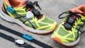
A look at the pod, installation, de-installation:

As you can see above, the unit affixes to the back of your running shoe. It does this using moldable silicone, which needs to harden for about 6-9 hours before you head out and go for a run. This same silicone is used in other applications from automotive repair to cooking molds.
In my case the ScribeLabs folks grabbed my running shoes just after I landed in Calgary, and then returned them the next day with the unit installed.
For installation, you’ll be using the included moldable silicone. From there you essentially mold a small plot of land on the back of your heel to then push the pod holder into. The footpod then snaps into place just like any other footpod does. I didn’t have any issues during our trail run with the unit falling off.

The exact location isn’t super-critical (i.e. doesn’t have to be within 1-2mm of a specific spot), though the best locations tend to be where the surface is reasonably flat but with grooves and/or other dimples where the silicone can get and make a firm grip on things.
The one area I was concerned about was how easy it would be to rip the unit off the back of your shoe if you removed your shoes like I often do: Using the heel of one to hold down the other.
Despite my best attempts to remember not to do that, I did it twice on accident. Thankfully, neither time resulted in the pod being ripped off the back of my shoe.

Looking at the pod itself, it’s virtually identical in size to an existing/standard ANT+ running footpod. Below you can see the Suunto branded one hanging out next to the Scribe unit. Both units utilize the same easily found CR2032 coin cell batteries. The ScribeLabs folks expect that the unit will get about 40 hours of battery life in running mode.

When it comes time to remove the pod mount from the shoe (for example, when it’s time to retire that pair of shoes) it’s really as simple as prying it off. Or at least, that’s what we thought.
Turns out the back of my shoes have an exceedingly good surface for the moldable silicone to adhere to.

In our case we found a nice sharp little pebble nearby to slowly peal away the unit from the shoe. Normally you’d just have a flat blade screwdriver or so around, but we made due with some nature-made tools.

As you can see, the whole pod comes right off as a single piece. You can see how it leaves almost no trace behind (and I’ve since cleaned out the tiny bit more of silicone that’s down lower on the heel).

And, here’s the front view:

They’re still playing around with the exact procedures and recommendations for installation and removal, but based on what I saw it’s pretty straight forward.
Usage while running:

With the installation complete, it was time to head out for a run. The unit collects data at a rate upwards of 100 times per second in “Research Mode”, storing that within its 32MB internal memory.
From a running standpoint it’s really as simple as just going out and running. There isn’t any start button – rather, it’s just keeping track of the runs and saving files off as required. If you stop for a while, it’ll save the file. If you start, it’ll create a new file. Though, that’s likely to change a bit down the road, based on what I’ll describe in the following paragraphs.
The unit has a few modes for usage, with them being fairly open on which methods(s) will be used at launch. Here’s the run down:
Method One – Data Collection, then post-run transfer via ANT+ to computer/phone:
In this mode the unit will capture data from your run, while running. It keeps that data on the pod in memory and creates separate files for each run automatically.
At the completion of the run you upload your data via either an ANT+ enabled app (iPhone/Android platforms with ANT+ adapter or internal phone capabilities), or, you transfer it to your computer via an ANT+ USB stick and small app there.
From there the data is then uploaded to the Scribe platform. That platform generates metrics from the run (see last section). Or, it could also upload it to sites that support these metrics. This transfer would happen in a standard .FIT file that any application/platform/site could consume.
ScribeLabs has talked with Strava a bit about this, and I think that’d be a great direction to go in. It’d also add a bit of a unique service for Strava as far as running dynamics go, and also might lure some runners back from the service who felt that some of the changes over the past year on the running site have simplified things a bit too much. Ultimately, Strava running users are probably amongst the most tech savvy folks out there.
Method Two – Data Collection and transfer via Bluetooth Smart:
This mode is similar to Method One, where Scribe is recording the run in local memory.
However, instead of using an ANT+ connection, this mode makes use of its onboard Bluetooth Smart radio to upload the run data through an app on any compatible BT Smart device.
Method Three – Data Collection and live streaming to ANT+ watches:
This method is a bit of a wildcard, and will depend a bit on whether or not other companies want to both put together as well as adopt an ANT+ standard around the metrics. Today, the unit could easily send simple ANT+ cadence to any ANT+ capable unit (i.e. a Garmin watch). However, beyond simple cadence the watches out there on the market today wouldn’t understand the extra metrics that are sent (such as angles and speeds). That’s because there exists no standards for sending that information (called an ANT+ Device Profile). ScribeLabs is happy to work to get that done, but realistically they’d need a watch company to commit to offering those metrics in their units.
Funny enough, Garmin came along a few weeks earlier and announced their FR620 with the HRM-Run heart rate strap. The HRM-Run measures what Garmin calls “Running Dynamics”, which has some overlap in certain areas as Scribe. Since they measure in different places, they each have items the other can’t measure, or doesn’t measure as well.
The challenge is that Garmin is keeping the Running Dynamics ANT transmission private for the time being. Meaning that even if Scribe wanted to send the same metrics, it couldn’t – since it’s not open ANT+. Garmin’s reasoning is that it offers it a competitive advantage over other companies. That’s true to an extent, but I think it’s not really an either/or question – rather, one that would open up more research opportunities and ‘synergies’ (to use a lame marketing buzzword) between the two companies.
Ideally Garmin would work within the ANT+ framework to come up with a device profile that satisfies all parties (like how it’s done for power meters), and then support that. We’ve seen how this game plays out before, and it’s clear that long-term having an open framework is far better than a closed one.
Post-Run Metrics:
Now comes the fun stuff – all the data!
It should probably be pointed out that how this data is ultimately presented to users in a product will vary quite a bit from what you see below. These are all from my Moose Runaround.
Let’s dive into the graphs and then I’ll explain some of the non-graph things. First up is a plot showing pitch versus roll. This is a density plot showing data from the entire run.
Pitch is whether the shoe is pointed up or down, illustrated below by the little shoes on the graph (and the horizontal axis). Whereas roll shows how your foot rolls right vs left throughout the stride (similar to pronation and supination).
Each of the clustered dots represents a key position within the ‘cycle’ of a stride. You can for example see the foot strike, the toe off, and the pitch min (nearest my butt), and the pitch max (furthest forward my shoe goes). Now remember, you’re viewing what is effectively a 3D plot of my foot’s motion.

The red dots actually trace the ‘route’ my foot takes within each stride. The little black arrows were added to help illustrate things. When you think of a complete cycle, start with your foot all the way back (left side with yellow dots above). Then, it swings forward up to pitch max (without touching the ground), which is the very furthest and highest the foot will go in front of you. Now it starts to swing back under you and you have the initial foot strike (orange dots). As my foot strikes I roll through to max pronation (blue dots) on my way to toe off (purple dots) where my foot finally leaves the ground again.
Each shade of blue represents a range of pitch vs roll values with the lighter shades representing a higher occurrence than the darker shades of grey. There are three light areas in the above plot that represent foot orientations that occur frequently in the running cycle. The largest one near the center represents when the foot is in contact with the ground. The two smaller areas at either end of the plot represent when the foot is changing direction near the beginning and end of the swing phase.
Now, it’ll take a few times reading through the above paragraphs to probably have it all make sense. Ideally I’d have a video corresponding to the graph to show you, but I lack such things at the moment.
What does this mean in more simple terms? Well, first off I’m not a heel-striker, and I don’t have tons of pronation. My leg swings out a little bit more though on the return path (from back to front), which is ironically something that was noticed on my run as one of the ScribeLabs folks ran behind me. The data supports that above where you see the roll angle hits about -30* on that path.
Compare this for example to another plot by a different runner a week earlier:

The histograms below represent the distribution of the data for the collected metrics over the course of the entire 4.1 mile run. The tallest and lightest color bar represents the most frequently occurring value range during the run. Similarly, the shorter, darker bars represent value ranges that occur less frequently.

Next we’ll look at few other quick plots from my run. Below you see stride rate against Ground Contact Time, and then Stride Rate vs Peak G’s. It comes as no surprise that as my stride rate increases, my contact time decreases. And on the Stride Rate side, as my stride rate increases (typically when I run faster), then my peak G’s also increase.

Now, some of you may have noticed that the above terms also have some overlap with the new HRM-Run metrics from the Garmin FR620. Specifically: Ground Contact Time. Stride rate has always been there via footpod. In the case of Garmin, they can’t get Peak G’s, because of the fact that they’re measuring at the chest. And on the flip side, Scribe can’t get whole body Vertical Oscillation because they’re measuring at the foot versus the chest. This is a perfect example of where if both companies agreed upon a standard they could fill in the gaps of each other.
If you look at how Garmin displays their data (Garmin’s own HRM-Run device data), it doesn’t do the same type of correlation. It’s presenting each metric a bit more singularly.


Last but not least, here’s a look at tiny slice of the data from a simple 2D graph standpoint. What you see on the upper plot is the full foot cycle with the pitch shown. Each vertical orange line indicates when my footstrike occurs, whereas each vertical purple line indicates my toe-off.
The roll is displayed in a similar manner below that, with the same components of the stride cycle.

Next Steps

So, with all this data, what does it mean, and who’s it targeted at? And when can you actually buy the little thing?
Well, it’s a complex question. Very similar to data in power meters around left/right and power balance, there’s simply not a ton of concrete research and training guidance here. Widespread data collection devices simply haven’t been available until now to do that sort of research. Lab testing has inherent limitations compared to outside and real-world testing.
The biggest impacts they’re seeing is that different shoes and different orthotics have clear impacts on the data from just a single runner. This likely comes as no surprise to anyone who’s tested running shoes and had someone watch them on a treadmill. But the potential to quantify that might lead to more accurate shoe to person matching.
Second, they’re seeing trends with injured vs non-injured runners, or people coming back from injury. This was interestingly one of the few areas on the power meter side where left/right power balance can be an interesting metric to watch.
And finally, they’re noticing shifts between pre-season and end of season in metrics such as contact time and stride rate. Again, no surprise, but quantifying it is interesting. And with what’ll likely be widespread adoption of the metrics coming out of the Garmin FR620 data, this fits into that same general category.
Right now they’re targeting shipping in volume in April, with a focus on higher end and elite athletes (as well as just athletes who are interested in the science of it all). Their goal is to give much more clear visualization tools and apps to make the data easier to understand – and then determine how to make it actionable. As part of that they believe they can develop toolsets that can see shifts in time and potentially predict injury based on undesirable changes to the data being collected. For example they can very clearly identify shoe wear over time.
Ultimately, I think the data is pretty fascinating and I’m looking forward to seeing the visualization aspects simplified and become more actionable. I think bringing on partners in both the device and software industry should help them do that – as well as ensuring that those partners can help drive standards around the data collection.
As always, thanks for reading!
FOUND THIS POST USEFUL? SUPPORT THE SITE!
Hopefully, you found this post useful. The website is really a labor of love, so please consider becoming a DC RAINMAKER Supporter. This gets you an ad-free experience, and access to our (mostly) bi-monthly behind-the-scenes video series of “Shed Talkin’”.
Support DCRainMaker - Shop on Amazon
Otherwise, perhaps consider using the below link if shopping on Amazon. As an Amazon Associate, I earn from qualifying purchases. It doesn’t cost you anything extra, but your purchases help support this website a lot. It could simply be buying toilet paper, or this pizza oven we use and love.