Finally! It’s been a long time coming, with a lot of false starts, but it’s finally here!
The new site not only looks fresher, but has some legit useful new functionality in it. While many of you reading this post are now regulars that read my day to day ramblings, most of you likely started off looking for some information in a review or similar page.
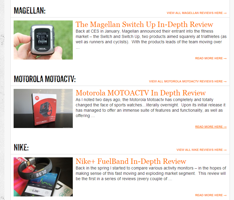
Starting with that area, I’ve made them a heck of a lot easier to find. Reviews are now automagically sorted by company and release date of product:
In the past this page would fall hopelessly out of date – but now it’s instant and up to date.
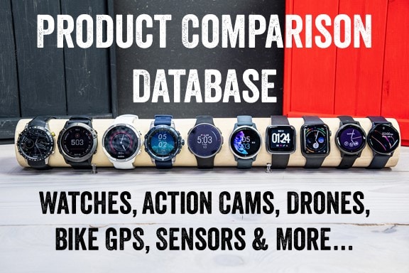
Next up is probably the coolest new feature – the Product Comparison Tool (or Calculator). In the past at the end of every review I had a little product comparison chart. The challenge with the chart (screenshot image of an Excel table) was that as soon as the next product or firmware version was released, it was out of date. Further, you were limited to compare based on whatever I thought was a valid comparison at 3AM on the night of the review release.
Now everything is instant, automatic, and configurable. It’s all in a backend database that has nearly 3,000 pieces of data (and growing) in it today from every watch I’ve reviewed.
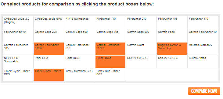
First, you’ll go to the tool website. Then, you’ll use the dropdowns to select what type of device you want (Swim, Bike, Run, Tri, Hike). Then, optionally, a price range (Budget, Moderate, High-End):
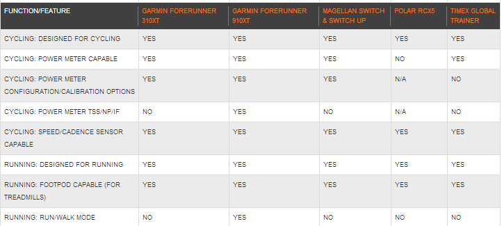
Once that’s done, it’ll highlight your units. From there, you can either add others, or deselect ones you don’t want. After which, a table will display below:
Simply click the expandomatic button to show the full chart length. If it’s over about 5-6 products, it’ll ask to pop-open a new window. If you wanted, you can add all of them in there I suppose.
Pretty cool, huh? Also, you can copy and paste the URL’s at the top if you want to send your custom chart to a friend – they always work forever.
And, as GPS unit firmware changes I can instantly keep things up to date. Awesomeness. It’s here if you want to play around.
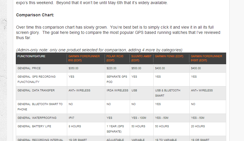
Even better, is that these charts are now in the reviews themselves as well, and automatically based on products in that category. And if a new product gets released in the same category tomorrow, it automatically shows up in all reviews in that category:
As of today, the charts are just focused on watches and bike computers, but over the next few weeks I’ll be pulling in other device types (i.e. the FitBit’s of the world, power meters, etc…). As always, if you spot an error or bug somewhere in there (I enter all the data by hand) – just drop me a note and I’ll fix it up. Plus, on the power meter front I’m working with some [really smart power meter] folks to start putting together a published database of units and head units that comply and produce accurate power information based on a series of tests developed.
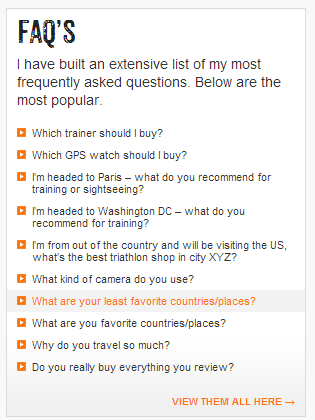
Next up, I’ve added a few other sections. First, a new gigantic and ever growing FAQ:
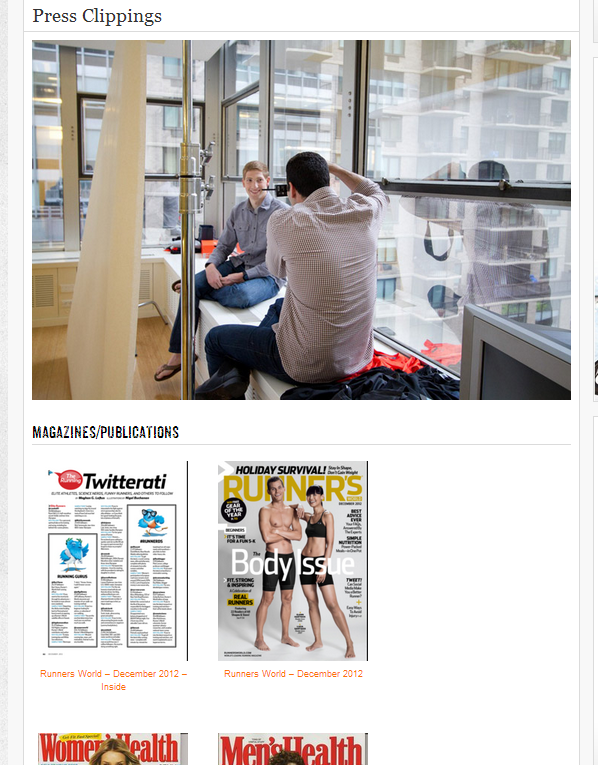
And second, a section with various press clippings. I’m still consolidating these and adding them in (and their detail):
Plus, stay on the lookout for a sweet new article about me coming in a big magazine this weekend!
Then there’s the long-promised Paris Blog dedicated area:
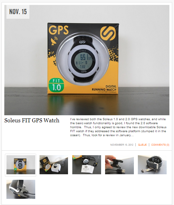
And last up – The Queue. This new section solves a problem I’ve had of being able to provide you with a pile of photos, screenshots, etc about a new product I’m testing – before I’m ready to write up a full review.
Essentially, this allows me to make quick spur of the moment galleries and dump a bunch of photos in there. Normally it’s a product I’m reviewing, but it could also be products on the show floor at a show like Interbike, CES or Eurobike.
Finally, there’s lots more coming in the weeks ahead! The goal was to get as much done before Thanksgiving as possible.
Of course, I do want to point out that none of this would have been possible without the rock star team of web designers and web developers that put everything together. I just tell them I want ponies that fart rainbows, and they somehow make it happen.
And, if you spot any confused ponies (site bugs), feel free to drop them below and I’ll ensure they start farting rainbows again. I appreciate it!
Hope you enjoy the new design – and thanks for reading! And I hope everyone in the US has a great Thanksgiving holiday ahead!
FOUND THIS POST USEFUL? SUPPORT THE SITE!
Hopefully, you found this post useful. The website is really a labor of love, so please consider becoming a DC RAINMAKER Supporter. This gets you an ad-free experience, and access to our (mostly) bi-monthly behind-the-scenes video series of “Shed Talkin’”.
Support DCRainMaker - Shop on Amazon
Otherwise, perhaps consider using the below link if shopping on Amazon. As an Amazon Associate, I earn from qualifying purchases. It doesn’t cost you anything extra, but your purchases help support this website a lot. It could simply be buying toilet paper, or this pizza oven we use and love.












It was à kind of strange the first seconds. But It It look great! Nice job.
Great work Ray – new site looks excellent… love to read it now but I’d be seriously late for work!
Congratulations on your new design. It looks great!
It seem that you came to the WP darkside… Great work, a lot of information available at a glance.
I really like the product comparison tool…
Congrats for the new design. Really cool !!
The product comparison tool groups Courses & Waypoints together (NAVIGATE: FOLLOW GPS TRACK (COURSES/WAYPOINTS) ) and therefore says Yes for the Forerunner 610. Isn’t that incorrect? I mean Waypoints Yes, but Courses No
Good idea, I like that. I’ll break it out tomorrow or Friday once my internet connectivity improves. Thanks!
the new design is very functional, good job!
I second the fact about splitting up the ability to run courses and navigate to waypoints
Also in your product comparison tool you seem to be missing the pool mate pro (or is it obsolete now?)
Congrats with the upgrade. One small feature request: in the product comparison, it would improve readability a lot if you’d put the “no’s” in red and the “yes’s” in green. Also, “good, great, …” would be a lot clearer if you’d replace them by some star-system IMHO.
I’ll convert to a rating system for the Good/Great ones (backlight and GPS acquisition I believe). I can see how that might be difficult to pin down. Thanks!
Just love the new design!
I take it you are not in India any more…
And when you were there who looked after The Girl’s Cupcakes?
No mobile version?
Mobile version is coming shortly. I expect you’ll see it go live later today or at the latest, tomorrow morning. Thanks!
through me for a loop at first, but it looks great!
Looks good, but I can’t see all the India pics. Bottom line, if it ain’t broke, don’t fix it.
Strange, are all of them missing, or just some? I’m not seeing anything gone – but I’d love to know if something is up!
Love the look and feel. Great job!! BTW, I see you combed your hair for that press photo :)
Nah, I didn’t. But a professional on-site stylist did. :)
See: link to dcrainmaker.com
The new site looks great.
My only feedback is that on the front page the 5 recent article bit isn’t very clear – at least on my monitor. With so many images on the site it isn’t immediately clear those 5 images select the article above. Some site use 5 dots. You might consider an arrow above the currently selected icon, or maybe make the border a bit darker and have it slide over during the transition.
Nice! First it’s like BAM – everything is new and unknown, but after a little while the new design rocks! congratulations!
New site looks great!! though it’s now harder to pretend that i’m reading something serious while at work…
Love the improved navigation!
Awesome redesign!
I think that in the “product comparison tool” you could let the user choose more than one sport.
For example, I want to compare products to “Bike AND Run”, but I don’t care about Swim, Tri or Hike.
This would be good because this way the tool will give better choices…
Congrats on the new design!! It sorta looked funny at first, but it’s really great!!
Looks great Ray!
As usual, awesome! The product comparo is unreal. Great job!
Two comments and a question?
1. The new site isn’t as good as the old on my iPhone. Otherwise I think it’s great.
2. On my PC the scrolling photo that is a link to various blog items needs to have some kind of left/right arrow so I can navigate. If I miss the photo/link I want to click on I have to wait or click the blog button in the tool bar at the top.
As long as I click to Amazon from your website, I can support the site no matter what I buy, right?
Thanks Tim-
The new mobile variant should be up sometime on Thursday, which should help there.
I’m looking at what we can so on the main page center portion. In the meantime, the posts are also found by clicking the BLOG button up top.
And yup, on Amazon, simply click on that link first and then shop as normal. Easy as pie!
Have a great Thanksgiving!
Great new update to the website – fantastic!!
What a beautiful surprise!
Congratulations for the new site and: it’s very nice and it’s a big improvement!
C’mon! ;)
Very nice, great work Rey. Enjoying your new site
Sweet! Looks awesome! I especially like the font. The one with white elements :)
The new site looks great! Very clean and functional.
Nice – very professional!
Really cool design. Was the comparison calculator custom written or a premium plugin? I have a similar site with portable generators for my emergency power backup installation business and this is the coolest thing I have ever seen.
Hi Steve-
Thanks!
It’s all custom written for DCR by the web development team noted above in the post.
But I’m pretty happy with it, very slick, and I continue to be able to expand into additional product areas very easily.