
Today, Google held their ‘Android Show’ event. Which is less of an in-person event, and more of a pile of early announcements & a livestream. Either way, this is essentially a pregame to next week’s big Google I/O in-person developer-focused event, where the company will outline much of Google’s software push for the next 12 months. If you’re familiar with the Apple equivalency, Google I/O is basically Google’s version of Apple WWDC (or Microsoft’s Build). Roughly-ish.
Whereas, this 23-minute livestream, was designed to be a trailer of sorts to that event. Point being, not everything is known yet, but we are seeing some early tidbits. Google outlined Watch OS 6 pieces in two different areas. First, with elements of the user interface that’ll be seeing a refresh, and the second, with aspects of Google’s Gemini (their AI platform) going to Wear OS 6.

I’ll revisit this all next week in more depth once the rest of the things are announced, but for now, here are the notable items. First, the AI bits with Gemini. Google says that’s coming to all Wear OS devices that currently support Assistant (so not just new hardware in the fall). You’ll be able to make natural language queries to it (just like on the phone), and it’ll take care of those requests (as long as you have connectivity, offline support isn’t here today).
Google gave examples such as the below (while in the middle of exercising):
– “Remember I’m using locker 43 today.”
– “Create a playlist for a 10-minute-mile run”
– “you can ask about the restaurant your friend emailed you about and get the answer right on your wrist — without needing to pause the workout and pull out your phone.”
You’ll notice that Google highlights non-Google watches throughout this presentation, such as the Samsung Galaxy Watch & Watch Ultra. And Samsung themselves confirmed these are coming to their watches as well.

Again, these won’t require new Wear OS hardware, as long as your current Wear OS device supports Assistant, the implication is it’ll support Wear OS 6 as well, and thus Gemini.

Next, there are the design language (UI) pieces. This version is named ‘Material 3 Expressive’, and starts on the Android 16 phone side, and then spills into the watch. Most notably, it’s all about the circle here. And more specifically, taking advantage of that circle in various UI animations and elements.
For example, in the below animation, the UI will shrink as it goes up/down to give a sense of ‘depth’:

That changing of size carries into the glanceable buttons, that’ll stretch out to the full size of the display (no matter which size the display is, smaller or larger:

Additionally, when you choose a color palette/theme for the watch face, it’ll carry through to the rest of the UI as well:

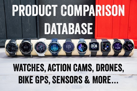
To me, this obviously signals one big thing: The circle is here to stay. We’ve already seen some leaks of the Pixel Watch 4 out there, and they certainly seem circle-like. I had really hoped that either Google would look to add a non-circle watch, or make some substantial change to the industrial design of the Pixel Watch. I believe it’s the single biggest thing holding it back. And certainly, they can still do that. There are plenty of cases where companies will announce developer-focused updates, and then add in additional components for the actual hardware release later (as seen with both Apple & Google).
Meanwhile, Google says they’ve found battery savings under the couch cushions, noting:
“And with Wear OS 6, we’re continuing to improve performance and optimize power — in fact, this update delivers up to 10% more battery life.”
Of course, we’ll have to wait till next week for the full Google Wear OS 6 details, and then likely sometime in the late summer or early fall for new watches. Last year, Google shifted up their announcement timeframe for Pixel Watches to August, and Samsung announced theirs in July. Previously Google had been in October, which was getting a bit late in the season for retailers and such to handle it in time for the holidays.
Likewise, going into the September timeframe is dangerous territory to run afoul of Apple announcements/releases, which no company wants to overlap. They’d all prefer to have their own limelight at other less populous times of the year.

Point being, these are just minor tidbits, with undoubtedly far more interesting new features and new hardware down the road throughout, not just next week, but this summer.
With that, thanks for reading!
FOUND THIS POST USEFUL? SUPPORT THE SITE!
Hopefully, you found this post useful. The website is really a labor of love, so please consider becoming a DC RAINMAKER Supporter. This gets you an ad-free experience, and access to our (mostly) bi-monthly behind-the-scenes video series of “Shed Talkin’”.
Support DCRainMaker - Shop on Amazon
Otherwise, perhaps consider using the below link if shopping on Amazon. As an Amazon Associate, I earn from qualifying purchases. It doesn’t cost you anything extra, but your purchases help support this website a lot. It could simply be buying toilet paper, or this pizza oven we use and love.


Nah, keep the circle. Apple Watches are, and always have been, hideously ugly things.
It’s less about the circle display per se (the focus of much of this post), and more about the overall industrial design of the hardware. After all, Garmin, Polar, Suunto, Samsung, COROS, and well…just about everyone else has primarily circle based watches.
Google here seems to be leaning far heavier into that clean circle design. With clean being the most important word. Thus, I suspect we’ll continue to see this ‘sleek’ design.
The problem is, consumers have overwhelmingly spoken: They don’t like the aesthetic of the Pixel Watch. No matter how much cool stuff the team is doing software-wise, people simply want more from the hardware design. At this point, it’s not really a debatable thing, every possible metric out there (sales, views, interest, etc…) supports this.
> They don’t like the aesthetic of the Pixel Watch
I’m guessing Google is leaning heavily into the idea that Pixel products are “pure” Android, and this sleek/clean design is part of that. But it’s just a guess.
No doubt.
But as with all design tradeoffs, they have to decide whether they want to sell more watches that people want to buy, or sell the idea of a sleek design.
On paper/specs, the Pixel Watch should easily beat the Samsung watches in most categories (running features, accuracy, integration to Google ecosystem, etc…). But in reality, getting people excited about the Pixel Watch style has been really challenging since it was first introduced.
Circles are a great form factor for containing rotational moving things….like hour, minute and second hands. When it comes to presenting information in text form, for humans who (in many languages) read laterally before they read vertically, they fall down quite badly. We don’t take circular photos, use curricular bank cards, or do much at all that lends itself to that form factor. Flat sides also don’t create a pressure point on the inner side of the wearer’s wrist.
„ The problem is, consumers have overwhelmingly spoken: They don’t like the aesthetic of the Pixel Watch.…“
Is it really the aesthetics they don’t like?
(I personally don’t like rounded display edges, they are so extremely reflective!)
Or rather the price and battery life?
Let’s wait until the iPhone -> Apple Watch forced marriage is finally broken up in the EU.
And you can finally use any watch like the AW, because Apple$oft is no longer allowed to hinder the competition.
„ On paper/specs, the Pixel Watch should easily beat the Samsung watches in most categories (running features, accuracy, integration to Google ecosystem, etc…)“
I think Samsung is far too strong and well-known as a brand for Google to achieve anything.
There are enough people who only want an Android smartphone from Samsung,
because they have always had good experiences with Samsung.
I also have some friends who buy like this:
Samsung smartphone, Samsung tablet, Samsung TV…
I wonder what they would consider for a smartwatch? ;)
While I finde the square design of the AW quite atrocious, the Pixel watch is equally dreadful and boring. It actually looks like the ghastly version of a round AW. But I guess there are millions of people out there who disagree with my idea of how a watch should never look like.